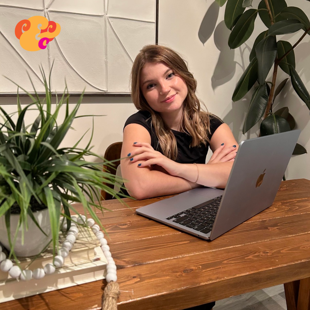
Carrie & Co. Creative
The Brief
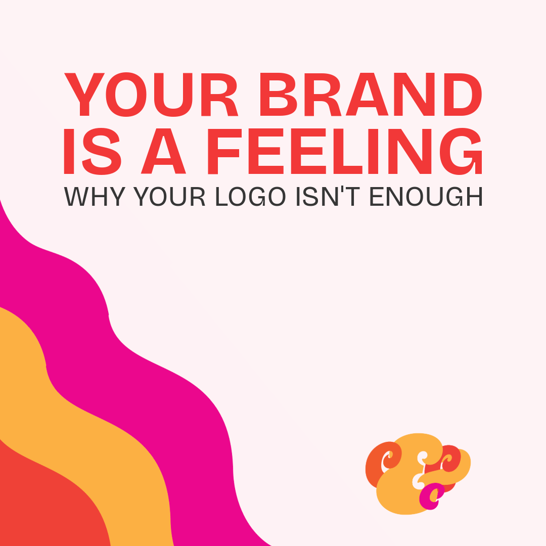
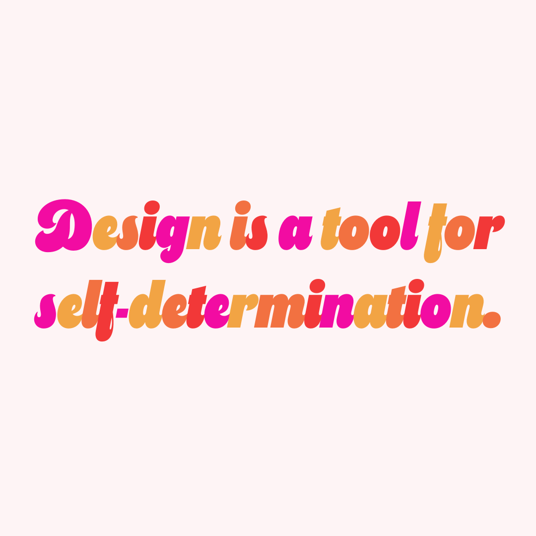
How do you build a design studio that feels high-end and editorial, but unapologetically bold and culturally rooted? The goal for the Carrie & Co. flagship identity was to create a "Vibrant Luxury" aesthetic—proving to potential clients that premium design doesn't have to mean sterile, boring minimalism. The brand needed to feel expensive, highly strategic, and full of life.
The Visual Strategy: Clean Meets Loud
To achieve this balance, the visual identity was built on a "Clean Studio" foundation. A quiet, premium canvas of soft creams and pale pinks gives the typography and portfolio work room to breathe.
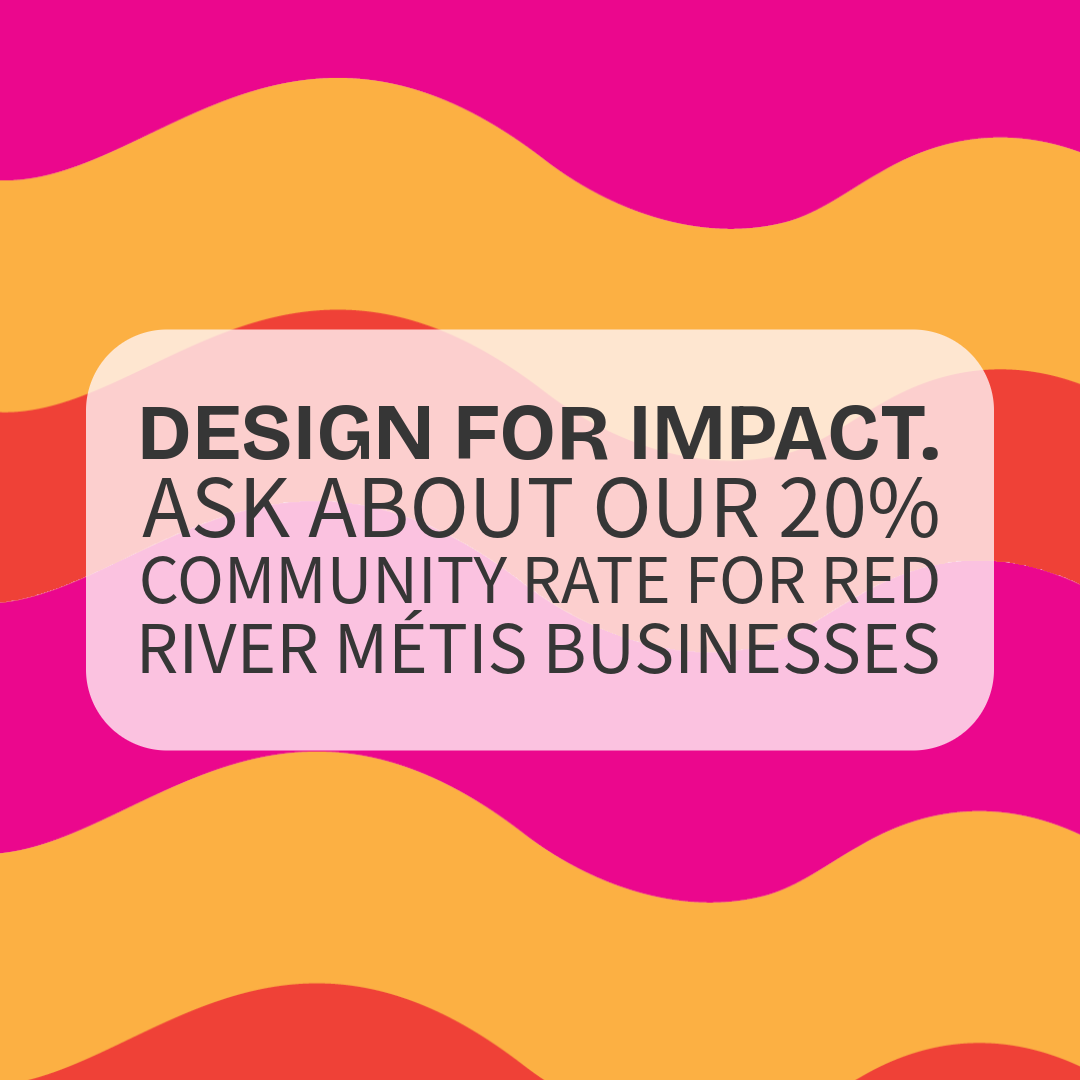
To disrupt that quiet foundation, I designed the brand's signature "Infinite Wave." This custom-illustrated, continuous ribbon of hot pink, orange, and yellow acts as the brand’s super-graphic. It is mathematically precise but highly energetic, representing the unstoppable momentum of the visionary founders Carrie & Co. partners with.
The Ecosystem
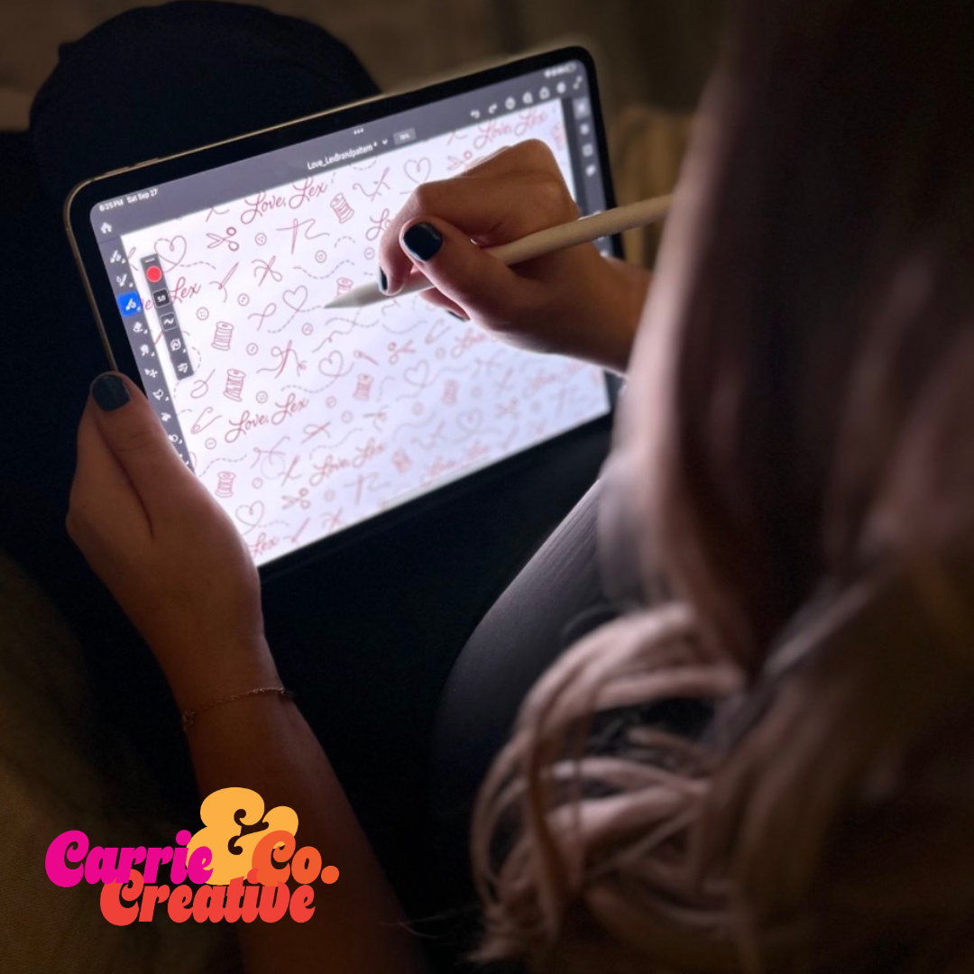
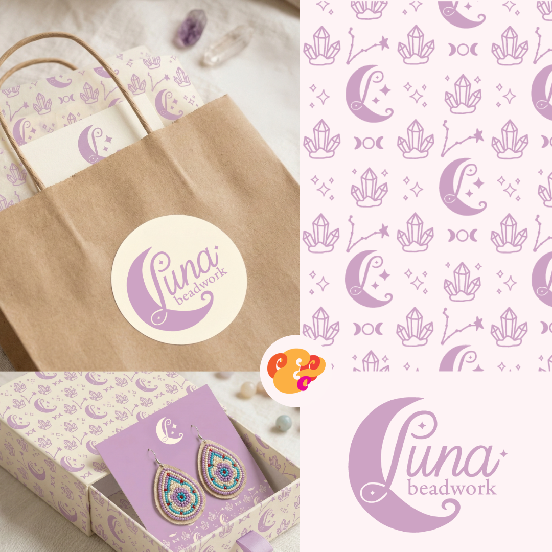
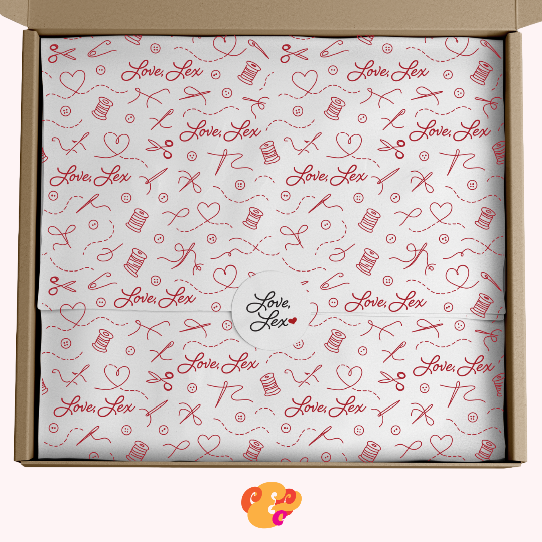
Beyond the logo, the brand identity was translated into a fully cohesive ecosystem—from heavy, premium-touch business cards to a strategically paced 9-tile social media grid. Every touchpoint is designed to be strategic, vibrant, and unforgettable.
Deliverables:
Brand Strategy & Positioning
Primary & Secondary Logo Marks
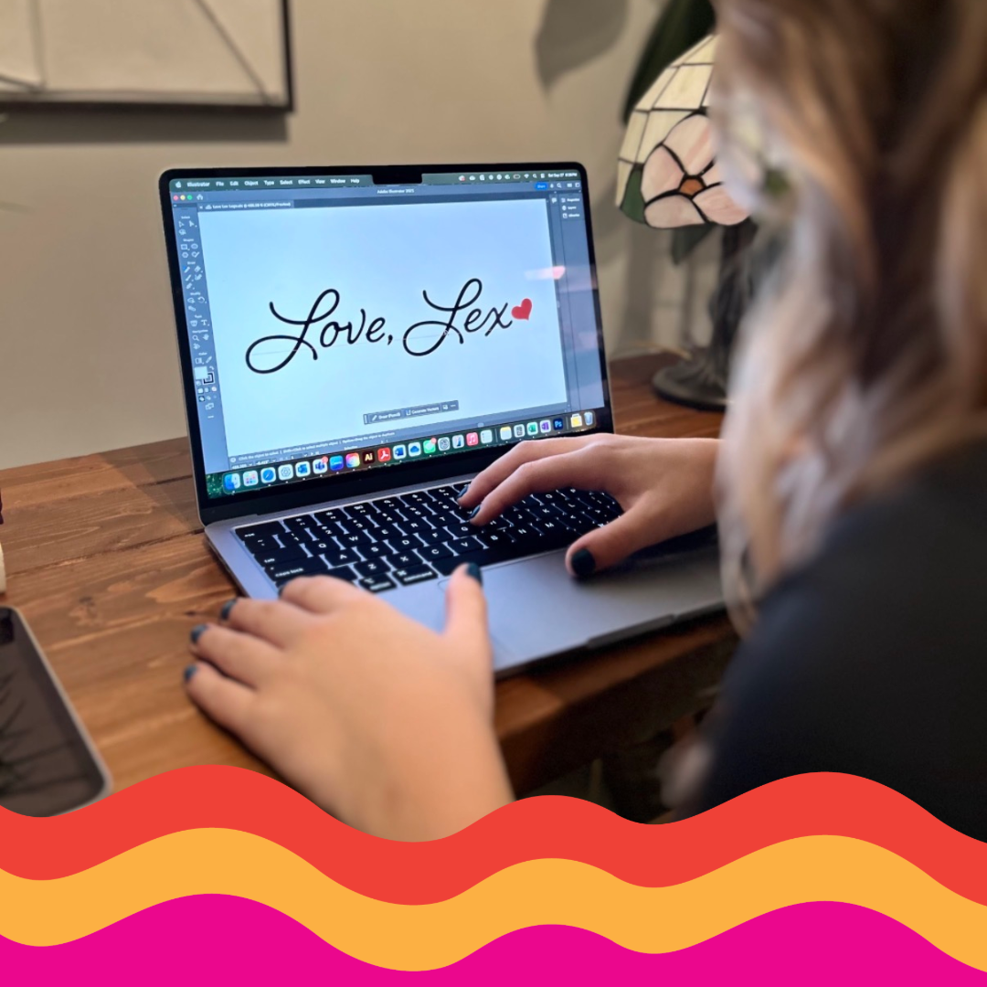
Custom Illustration & Pattern Design (The Infinite Wave)
Print Collateral & Digital Ecosystems